Flight Status Dashboard
U.S. airline and airport performance — delays, cancellations, on-time rates. The stakeholder question was simple: "Which airline should we rebook on?" The answer needed one filter, not five.
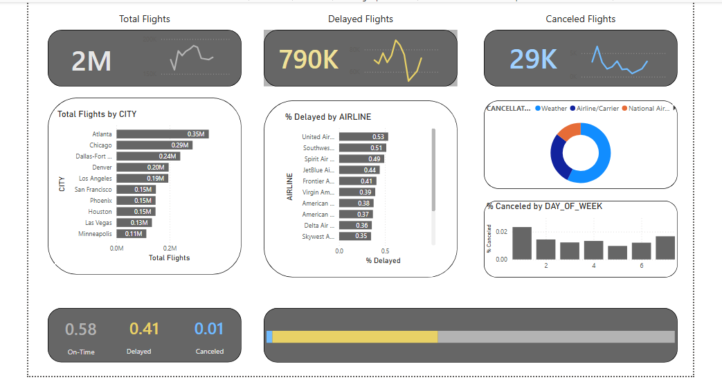
The question
When a flight cancels, a travel operation must rebook dozens of passengers — on whom? The answer lives in public U.S. DOT data: on-time rates by airline, delay causes, cancellation patterns by airport and season. The raw data is designed for regulators, not for dispatchers.
The approach
- Power Query for the heavy lifting. Typed the raw extracts, unpivoted delay-cause columns, and merged airline/airport dimensions before anything reached the model.
- A star schema that answers the question. Flights fact table + airline, airport, and date dimensions. One DAX measure for on-time %, reused everywhere.
- One page, one decision. Airline ranking on top, causes underneath, airport drilldown below — no page navigation required.
Findings
Rankings flip by context
The "best airline" nationally is not the best at your airport in your month. The dashboard ranks within the filtered context, not a national average.
Cause matters more than rate
Weather-heavy carriers look worse than they operate; controllable-delay share is the fairer comparison — so it got its own visual.
One filter, not five
Route + month in, answer out. Every extra filter was tested against the rebooking question and cut if it didn't sharpen it.
What I'd do differently
Row-level context labels. A "78% on-time" number without its sample size invites over-reading. I'd add flight-count captions to every card.
Automate the refresh. DOT data updates monthly; the pipeline should pull on schedule, not on my laptop.
Tech stack: Power BI, DAX, Power Query, U.S. DOT on-time data. PBIX in the repo.